Categories for
this article
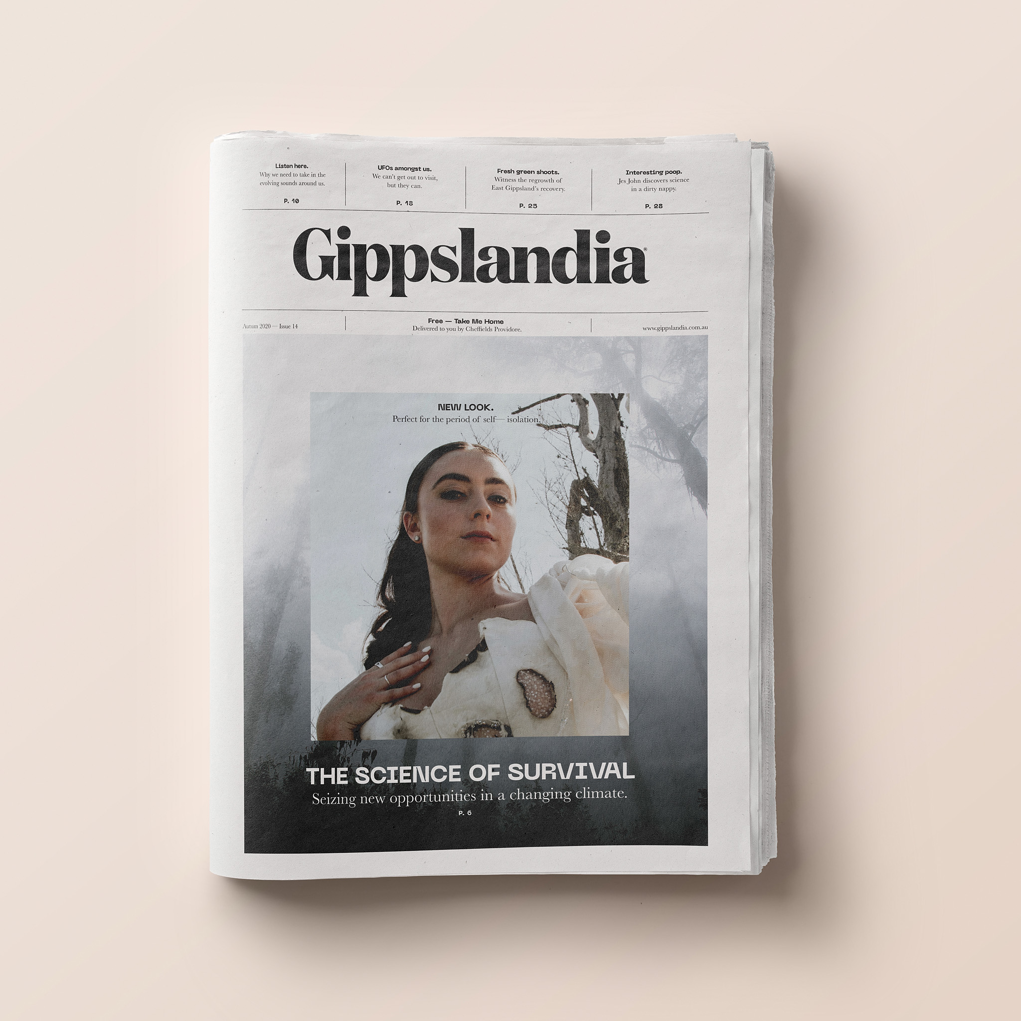
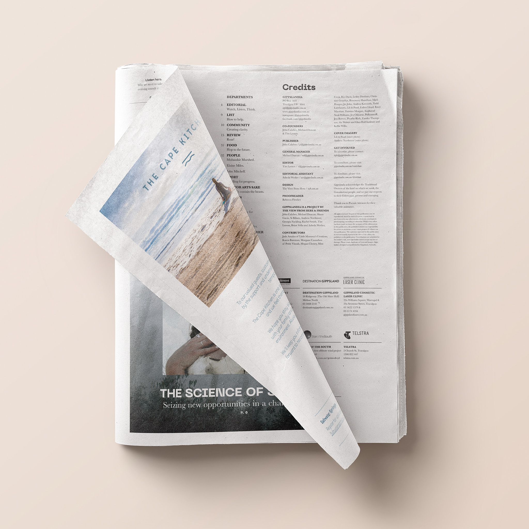
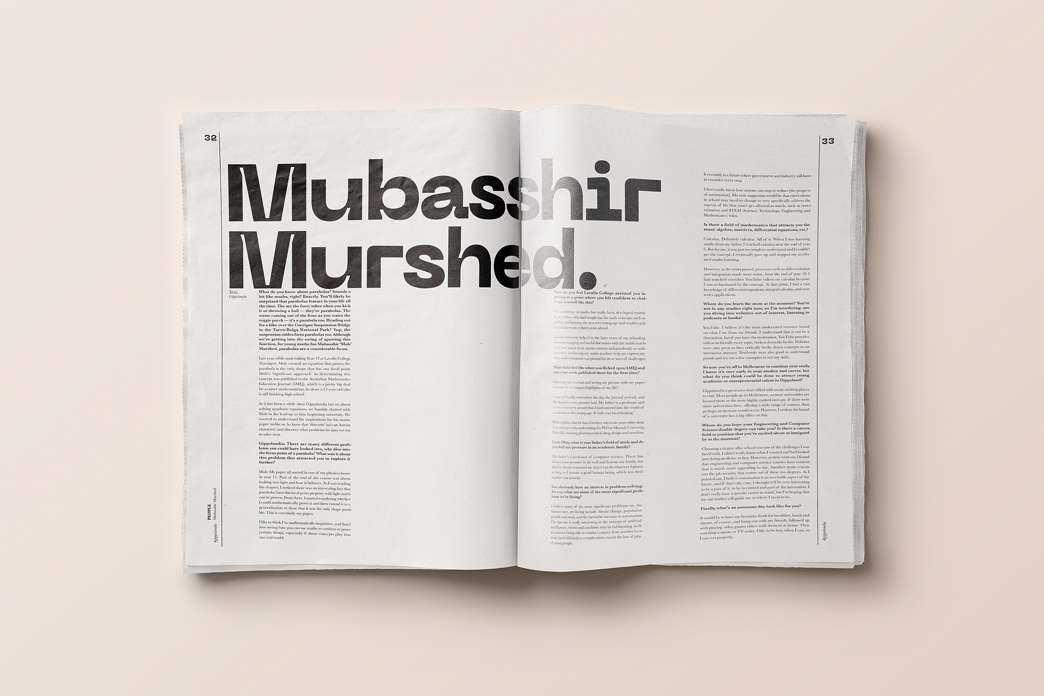
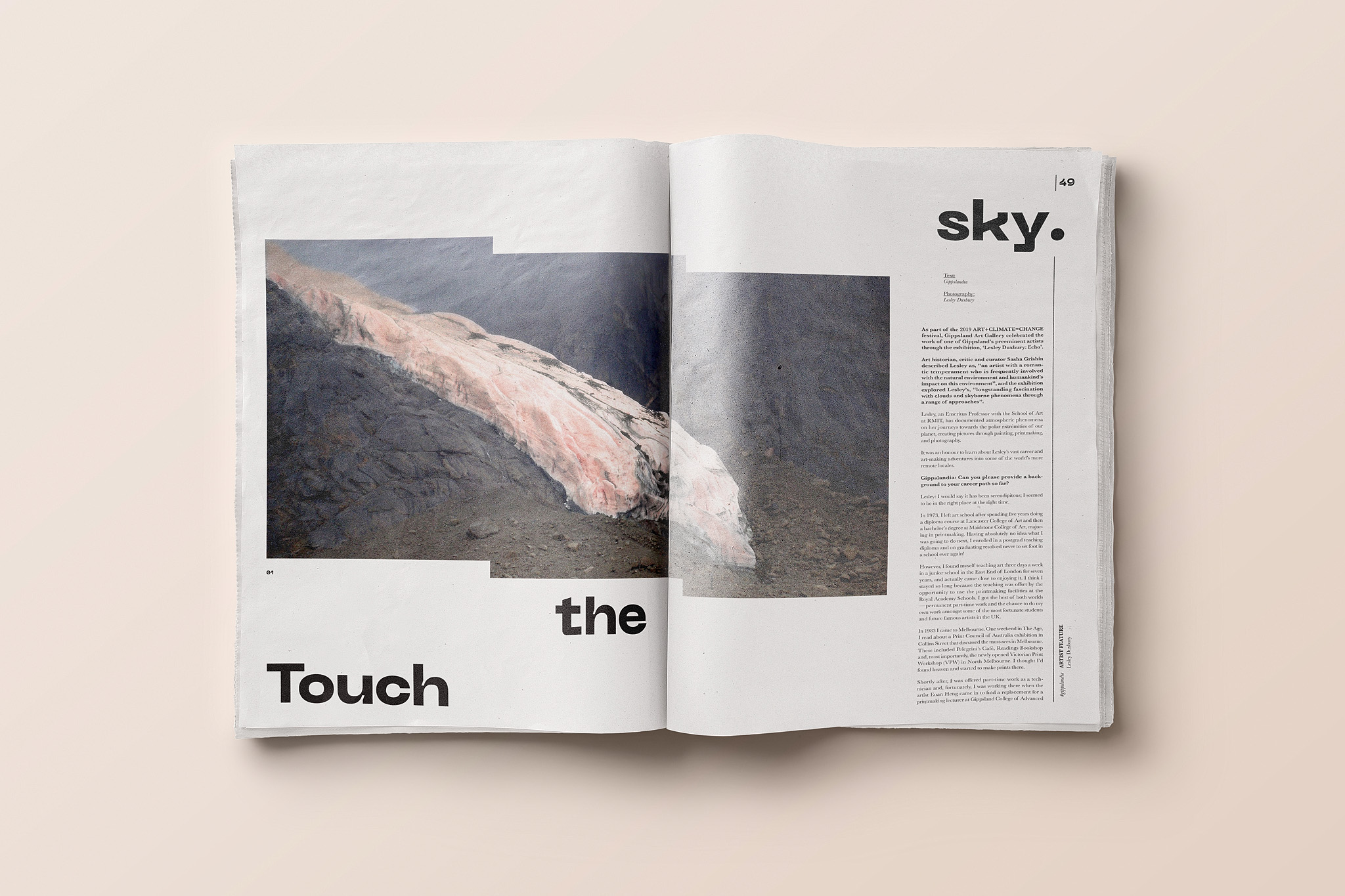
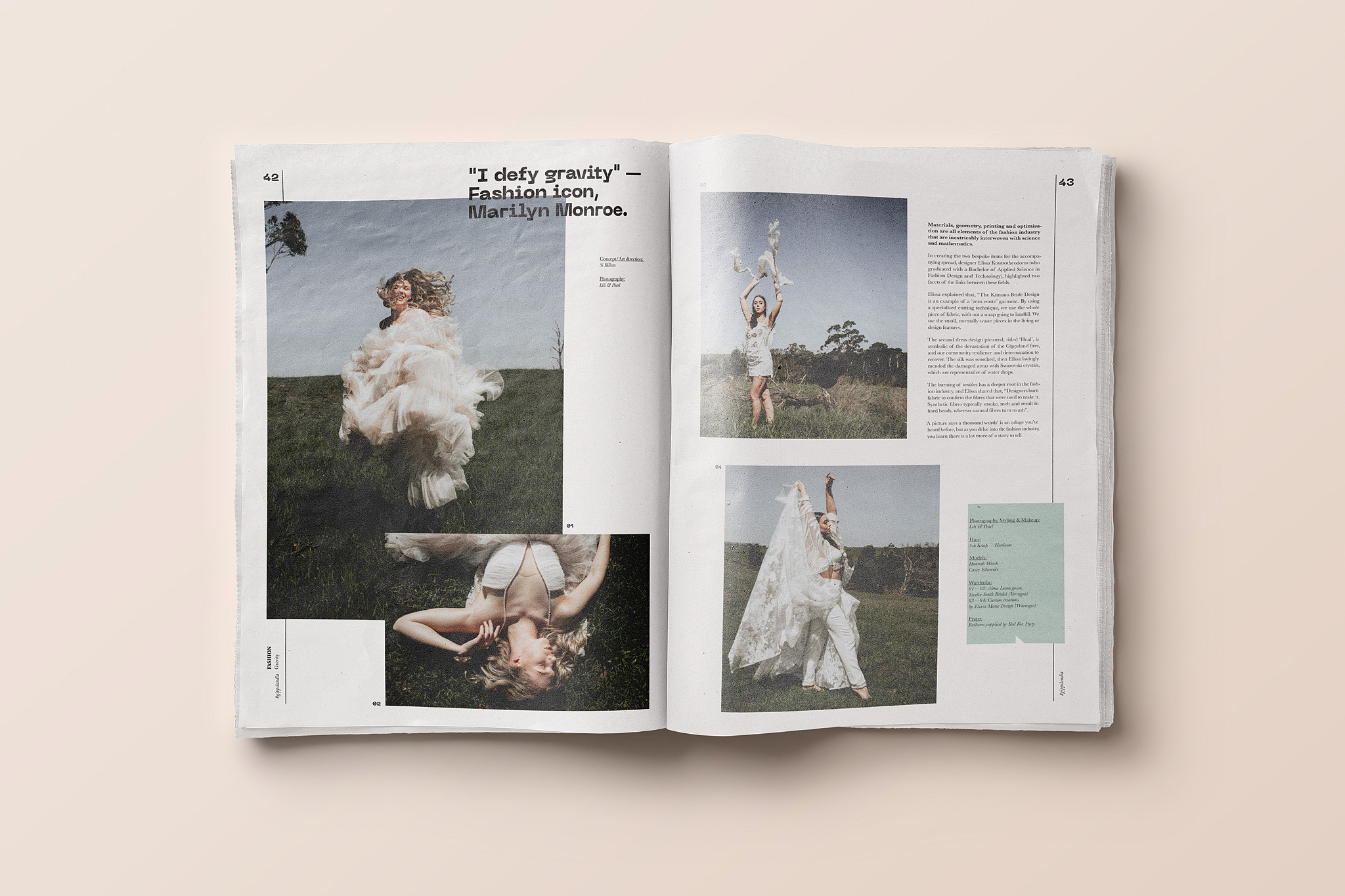
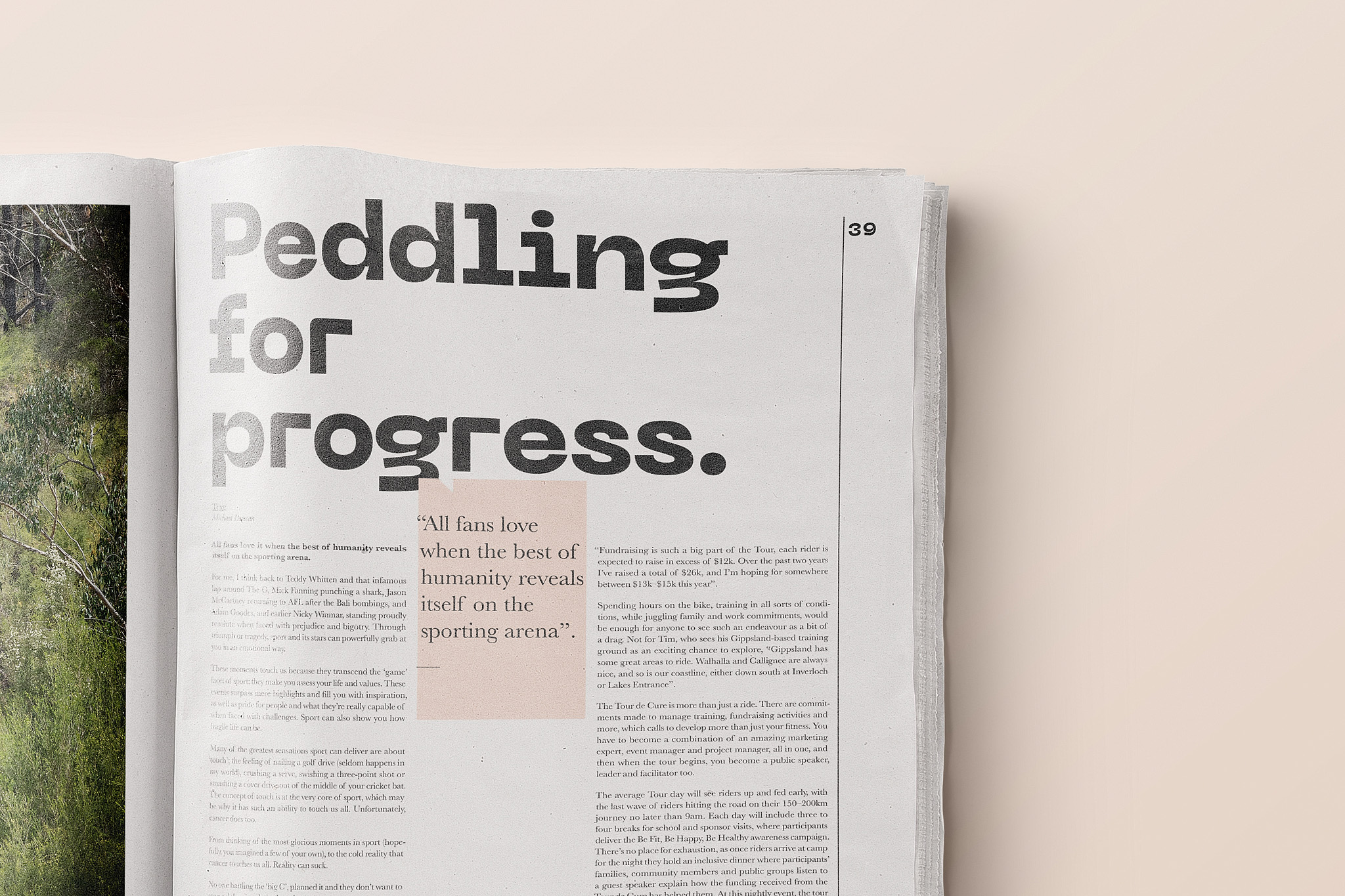
After three incredibly successful years, it was decided that Gippslandia was in need of a redesign to freshen up the pages. Issue #14 being the first issue of 2020, embodies a new look, but the same quality content, this time surrounding ‘The Science of Survival’, a quite fitting theme considering the circumstances. The Gippslandia cover has been updated, adding more structure and clarity, however not overhauled completely as it still stays true to its heritage. The typefaces have been switched around to inject a more mature, grown up and ‘coming of age’ style, while also retaining an edge of youthfulness. Although the original look was not broken, Gippslandia needed to abide by its very own philosophy — never stand still, and continue to be forward thinking and progressive to match its content.
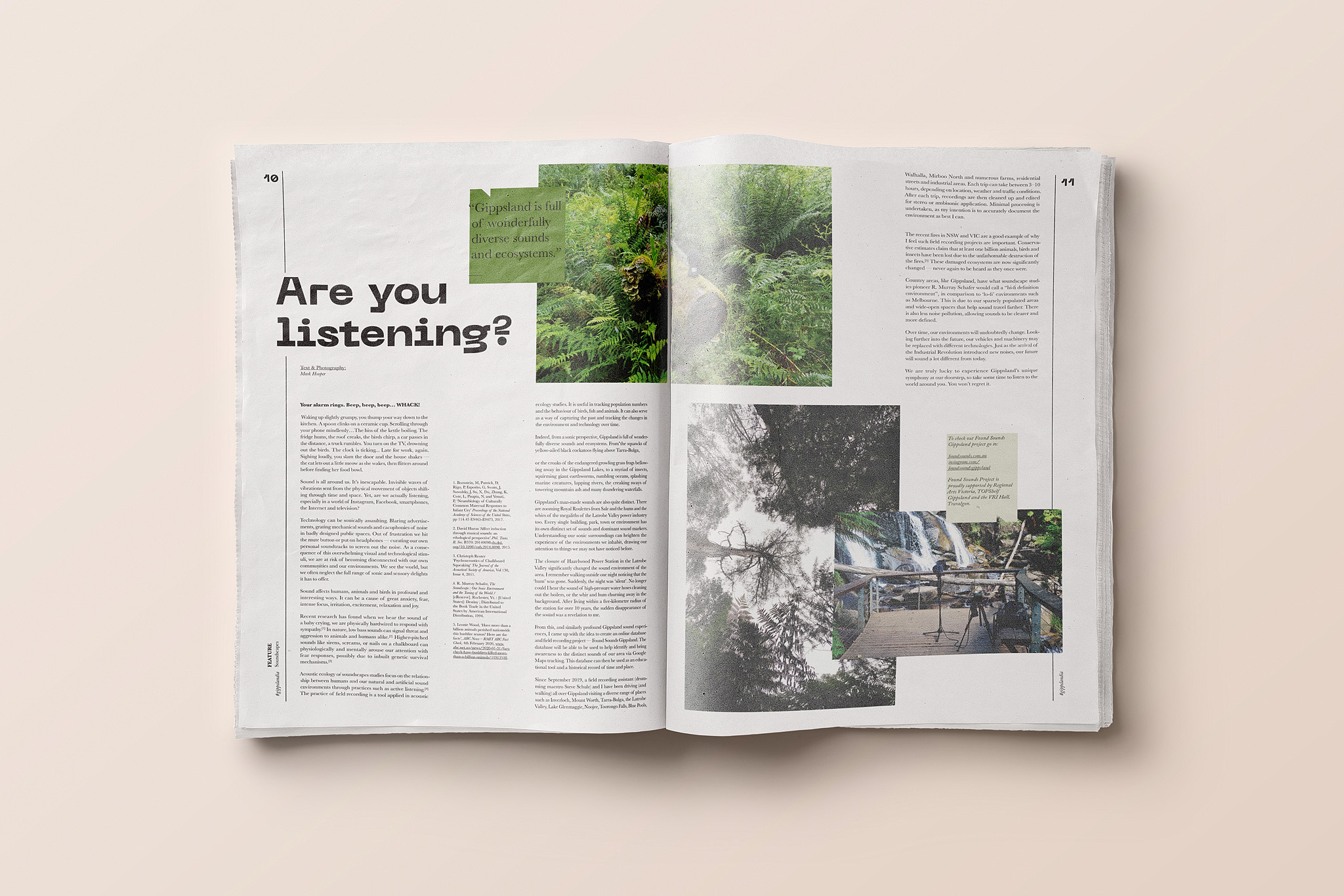
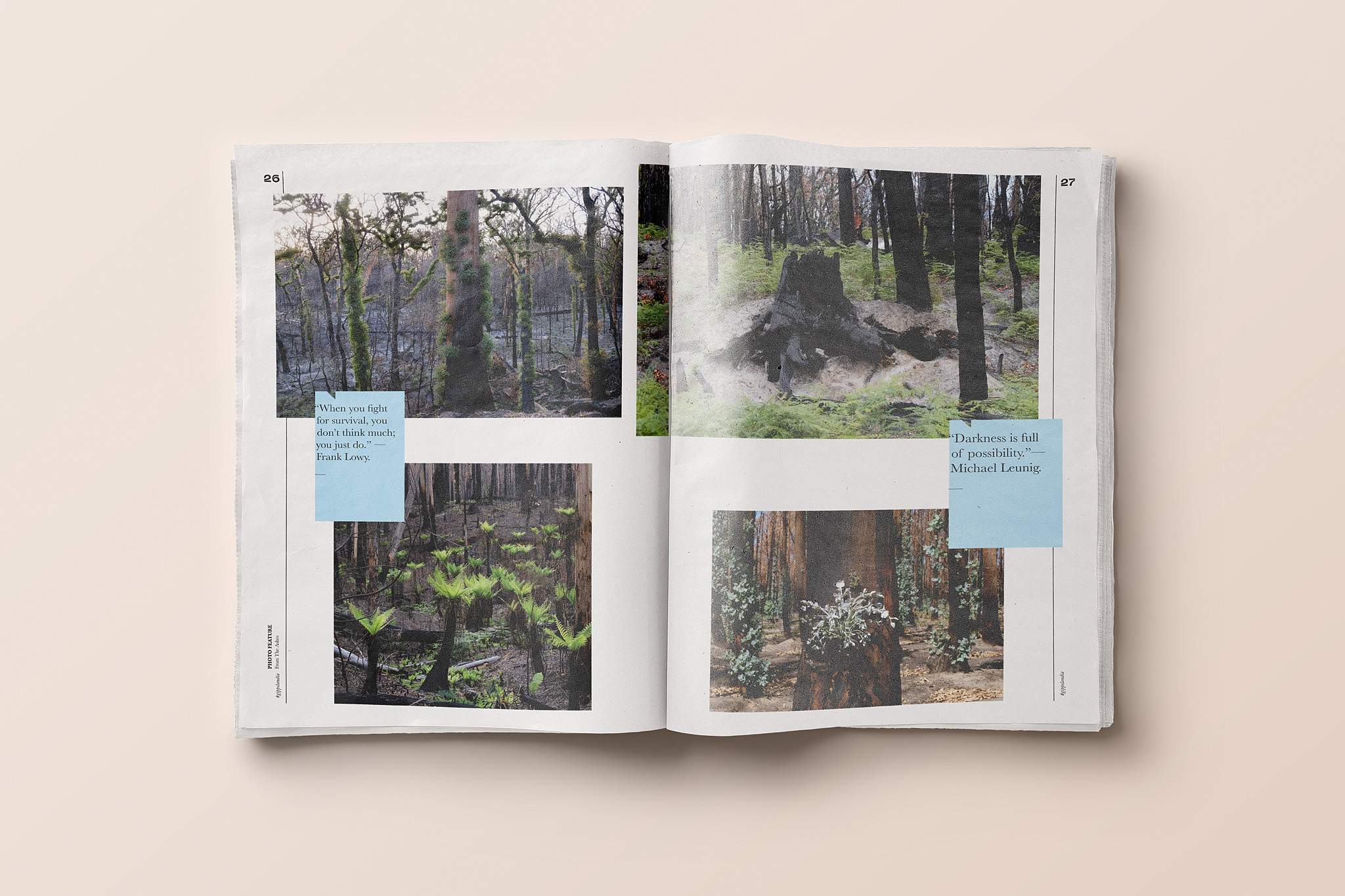
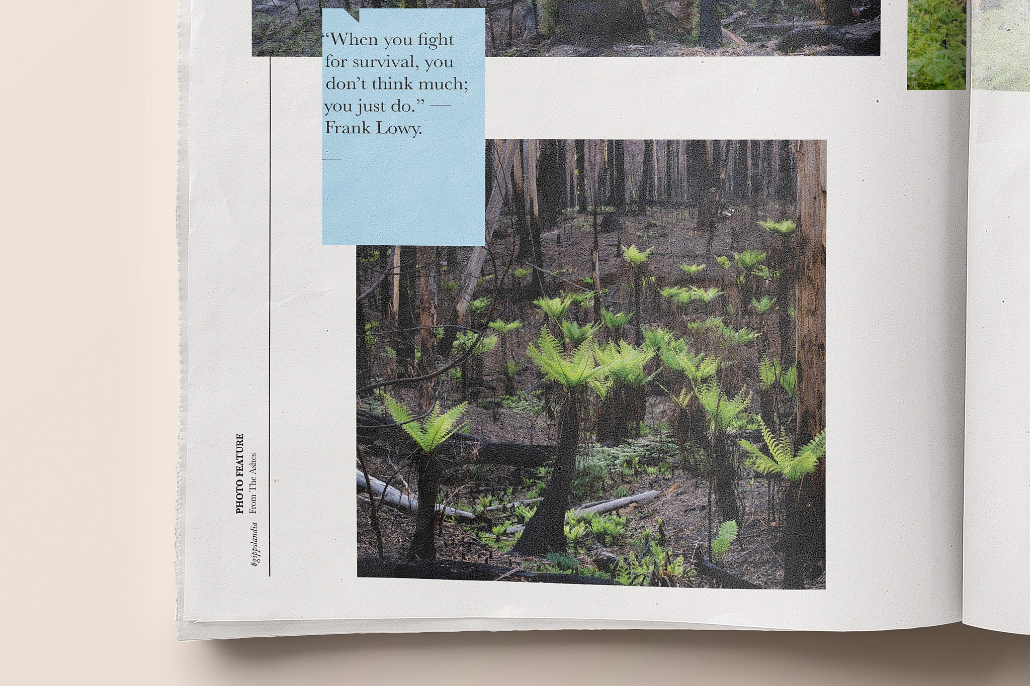
Further updates include the body text changing to a serif typeface, increased size and set the text in straight justified columns to aid legibility. The introduction of pullout quote boxes were designed as extra entry points into the articles while reflecting and referencing the new headline font, and suit the colour palette specific to each individual article. White space as a visual device has also been encouraged wherever possible.
To guarantee a copy of the latest issue be sure to subscribe online at www.gippslandia.com.au
