The latest
You should check
out Gippslandia
We’d love to chat
Visit us
Level 1/43 Hotham Street
Traralgon VIC 3844
Visit the studio
Level 1/43 Hotham Street
Traralgon VIC 3844


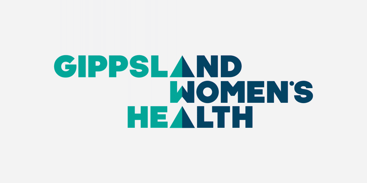
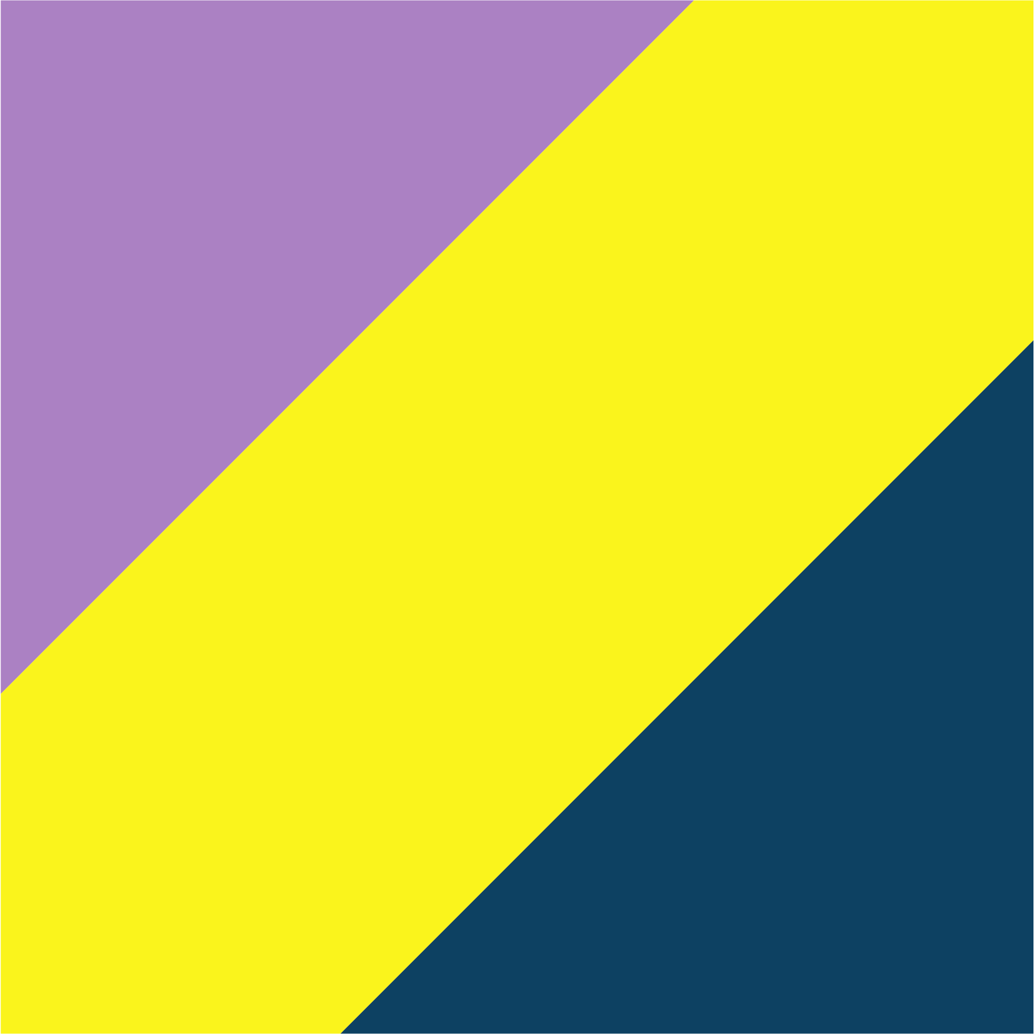
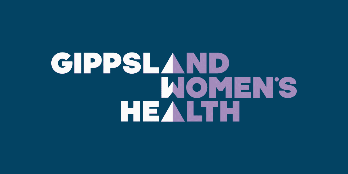
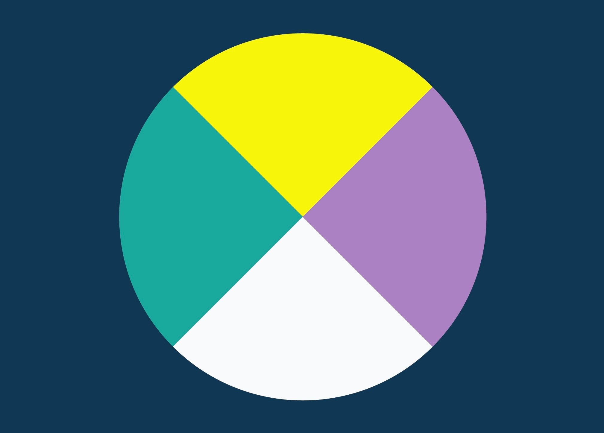
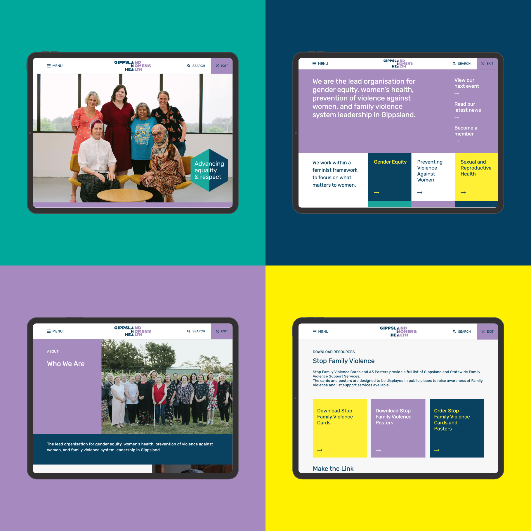
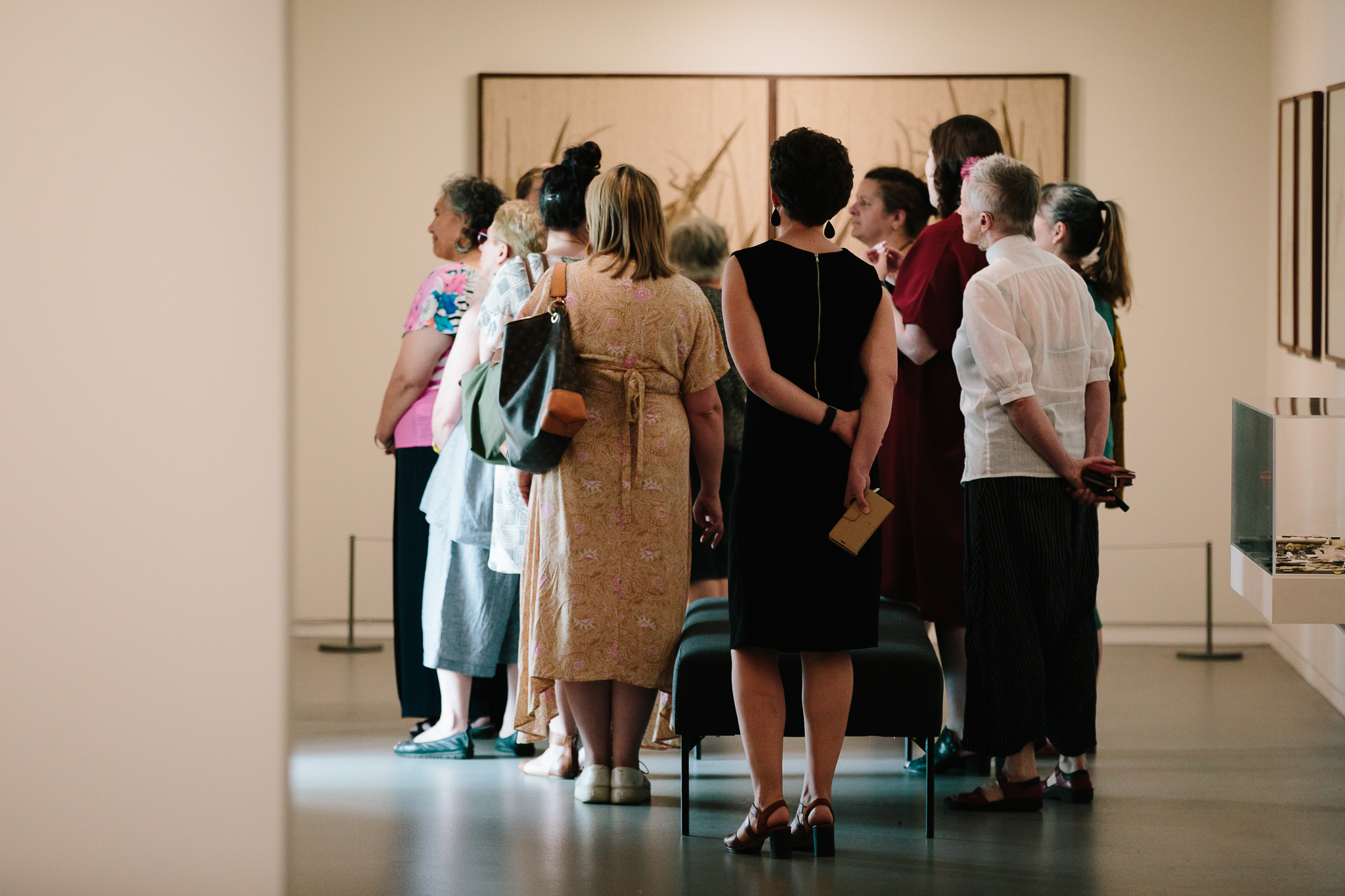
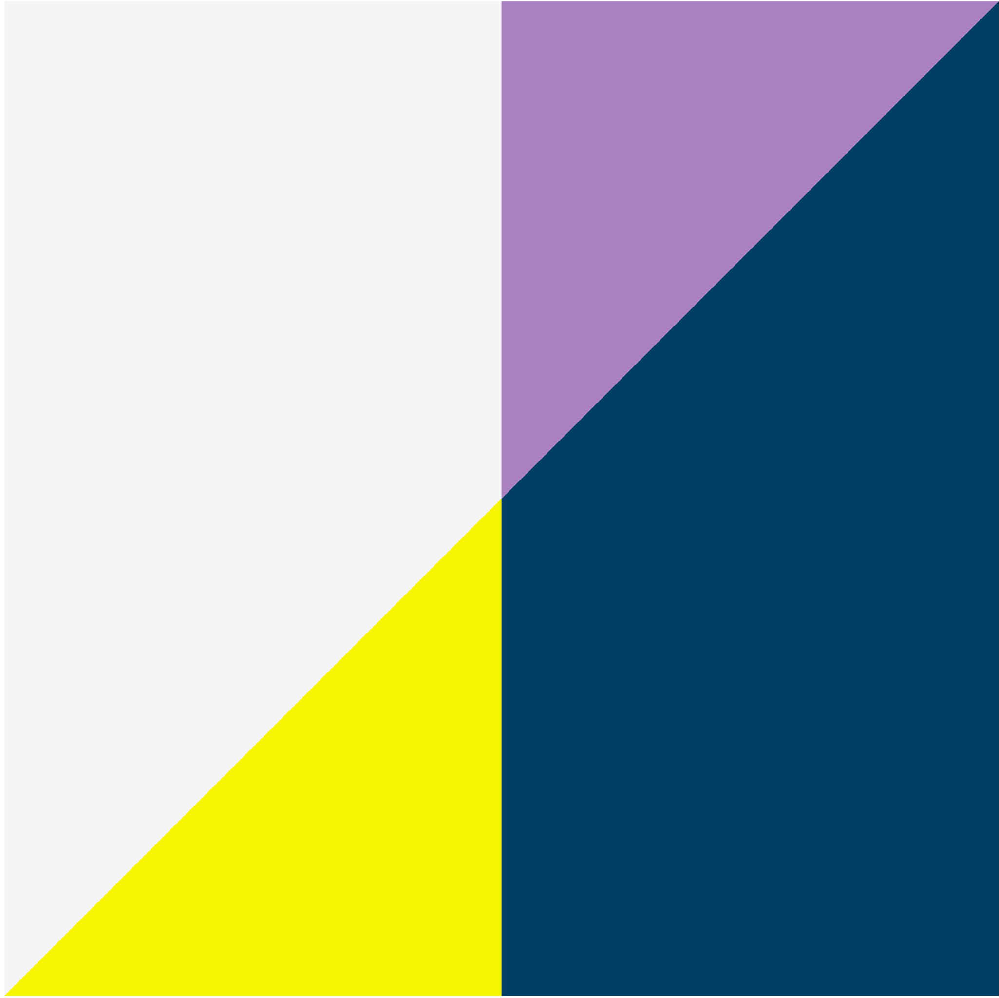
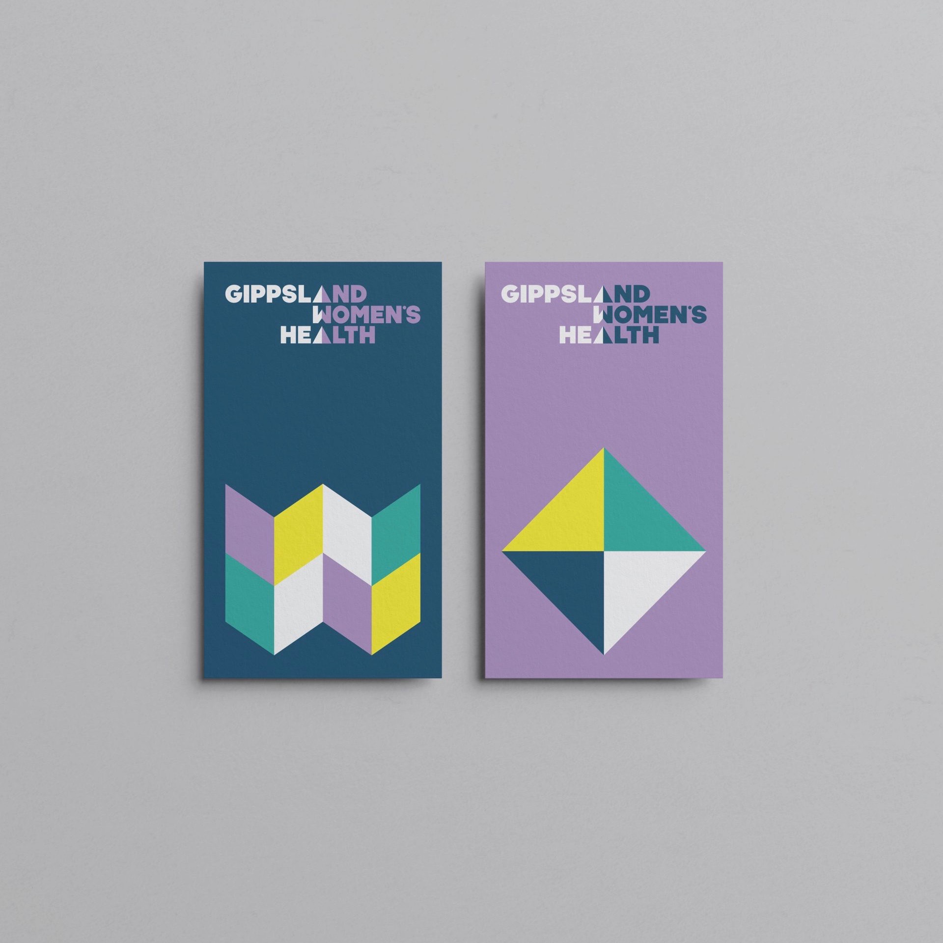
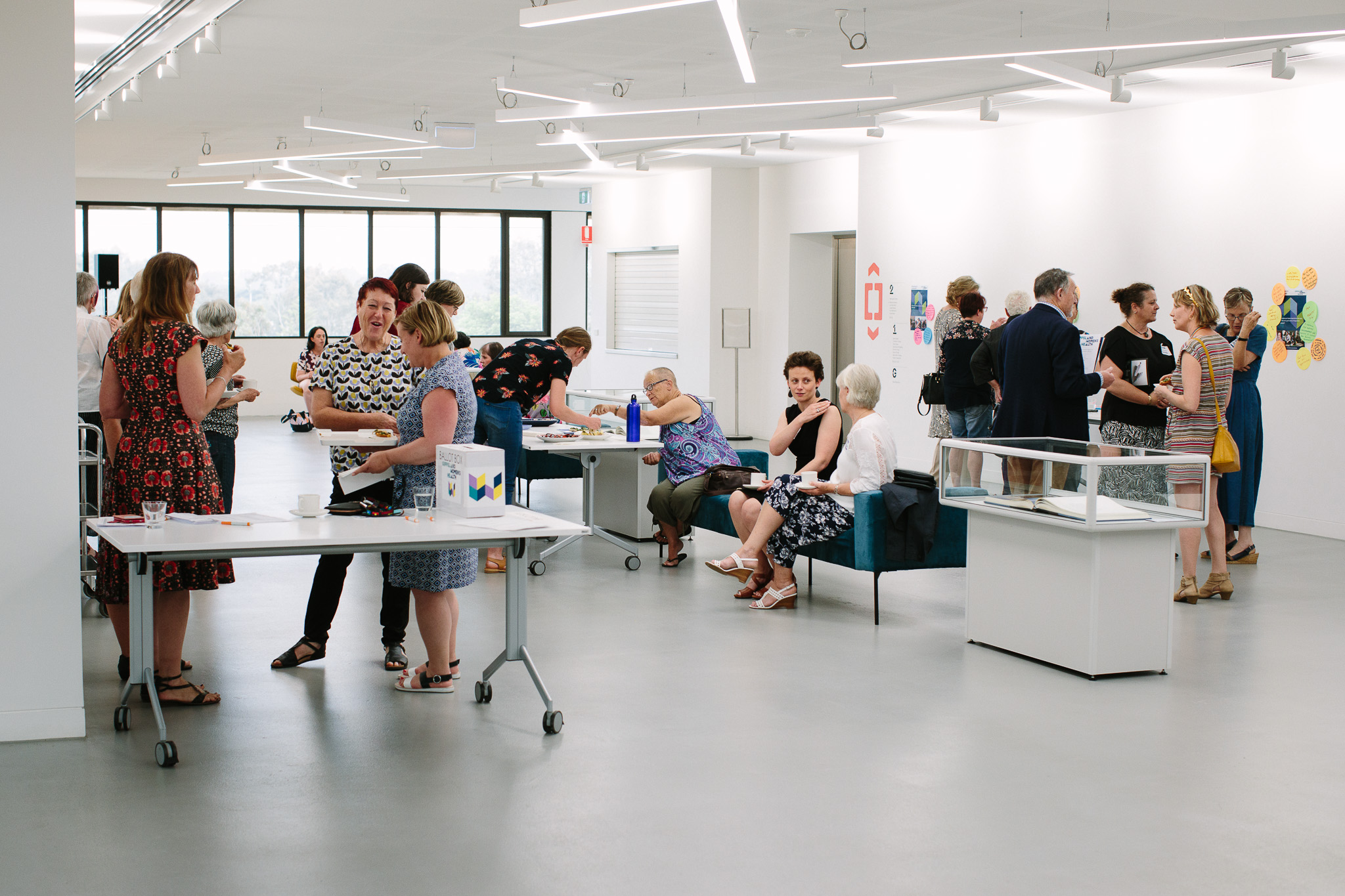
Pivotal to the brand’s success was inclusion for all of Gippsland’s women — from diverse photography to accessible typography and considered website functionality. We harmoniously balanced two equal parts on a central point to create their logo, complimented by graphics embracing diversity. Historically, the organisation adopted purple and green as an ode to the Suffragette movement — we introduced dark blue to represent their influence at policy level, and yellow as a positive beacon for women’s progress.


You should check
out Gippslandia
Level 1/43 Hotham Street
Traralgon VIC 3844